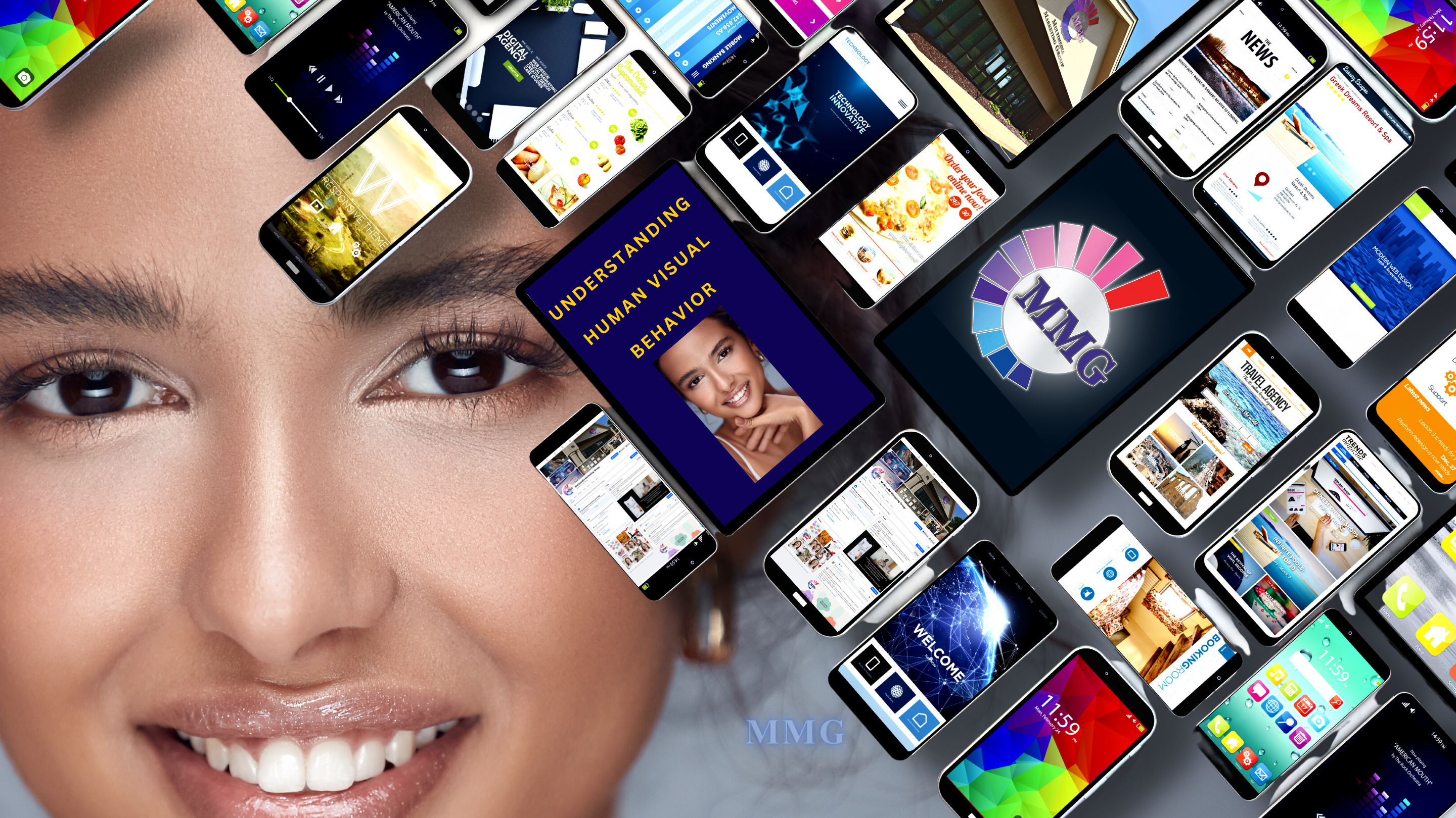
Today in our society, where information overload is the norm, the visual appeal and functionality of your content are paramount. Crafting materials that seamlessly blend captivating design and compelling content can significantly impact your marketing and communication success. This white paper delves into the critical role of understanding human visual behavior and the art of effective page layout and design in achieving multimedia marketing excellence.
Understanding Human Visual Behavior

The user’s journey begins the moment they encounter your multimedia marketing content—whether it’s a website, email campaign, or social media advertisement. Understanding human visual behavior is key to shaping the experience. It’s akin to reading the letter “F.”
The eye begins its scan at the top left corner, traverses horizontally, takes a brief dip downward, continues horizontally, and eventually gravitates down the left side of the page. This inherent scanning pattern serves as the blueprint for how multimedia marketing materials should be thoughtfully structured.
The Elements of Effective Page Layout and Design
To create multimedia marketing materials that resonate with your audience, you need to grasp the core principles of effective design.
Here are fifteen key principles and elements for you to consider:
- Hierarchy: Establish a clear visual hierarchy to guide the viewer’s eye through the content. Use varying font sizes, colors, and placement to emphasize important elements, such as headlines, subheadings, and calls to action.
- Balance: Maintain a balance between different elements on the page. Achieve visual equilibrium by distributing text, images, and white space evenly. An unbalanced layout can be distracting and unappealing.
- Alignment: Consistent alignment of text and images creates a cleaner and more organized appearance. Choose left, right, center, or justified alignment based on your design’s aesthetic and content.
- Typography: Select fonts that are easy to read and appropriate for your audience. Use a limited number of fonts to avoid visual clutter. Pay attention to line spacing (leading), letter spacing (kerning), and line length (measure) for optimal readability.
- Color: Choose a color scheme that aligns with your brand and evokes the desired emotions. Consider the psychological effects of colors and use them strategically to highlight key elements or create visual interest.
- Whitespace: White space, or negative space, is as important as the content itself. It provides breathing room, improves readability, and focuses the viewer’s attention. Don’t overcrowd your layout.
- Consistency: Maintain a consistent design throughout your marketing materials. Use the same fonts, colors, and design elements to reinforce your brand identity and make it easily recognizable.
- Imagery: Use high-quality images and graphics that are relevant to your content and message. Images should support your narrative and evoke the desired emotional response.
- Simplicity: Keep your design clean and uncluttered. Simplify complex ideas and information for easy comprehension. Remember that less is often more.
- Proximity: Group related elements together to establish connections and create a logical flow. This helps viewers quickly grasp the relationships between different pieces of information.
- Contrast: Use contrast to make key elements stand out. This can be achieved through variations in color, font size, or weight. Contrast guides the viewer’s attention and adds visual interest.
- Repetition: Repeating design elements, such as a specific color, shape, or style, creates unity and reinforces your brand identity. It also helps the audience recognize your materials as part of a cohesive campaign.
- Grids and Alignment Guides: Utilize grids and alignment guides to maintain a structured and organized layout. Grids ensure that elements are placed consistently and align properly.
- Accessibility: Ensure that your design is accessible to all audiences. Consider factors like font size, color contrast, and alternative text for images to accommodate those with visual impairments.
- Testing: Before finalizing your design, conduct user testing to gather feedback and make necessary improvements. Ensure that your materials look and function well on different devices and platforms.
Remember that effective design is a combination of art and science. It should not only look appealing but also serve its purpose by effectively conveying your message and engaging your target audience. Keep these principles in mind when creating multimedia marketing materials to achieve a design that resonates with your audience and drives your marketing goals.
Importance of Proper Placement
Proper placement is where the magic begins. The call-to-action (CTA), the ultimate catalyst for user action, must be positioned strategically—preferably on the right side of the page, “above the fold.” The concept of “above the fold” ensures that your most vital content is instantly visible without scrolling. Imagine your page divided into quadrants; the top right quadrant emerges as prime real estate for your CTA.
Designing for the User’s Eye
Designing for the user’s eye isn’t just about CTA placement; it’s about understanding where the eye naturally gravitates. The top-left and top-right quadrants are high-traffic areas where you need to make an impactful first impression. The central focus, often the middle-right side of the page, is another hotspot, capturing sustained attention. The left vertical bar is where the eye eventually settles, vital for more prolonged, in-depth reading.
Visual Excitement and User Engagement
Visual excitement, engagement, and readability is the lifeblood of multimedia marketing. Your design elements, be they images, graphics, headlines, or other visual cues, must act as signposts, guiding users through your content. Imagine your multimedia marketing material as a captivating journey, with each visual element beckoning the user to continue.
Visual Communication Is the Thread That Weaves Together
Understanding, Engagement, and Retention of Information.
 In a world filled with information and messages bombarding our senses from all directions, there exists a silent hero in the realm of communication — the art of visual communication. It’s the language of images, colors, and design that plays a crucial role in our daily lives, sometimes without us even realizing it.
Imagine a busy office, where professionals are constantly inundated with data and information. It’s here that visual communication steps in, like a trusted ally. When a complex report needs to be understood quickly, a well-crafted infographic or chart swoops in to rescue the day. In the blink of an eye, it distills intricate details into a clear and concise format, making it accessible to even the busiest of executives.
But it’s not just about efficiency; visual communication is also about clarity. In a world where words can sometimes fail to capture the essence of an idea, visuals step up to the plate. They remove ambiguity and make it easier for people to grasp and remember information. After all, a well-chosen image is worth a thousand words, and a cleverly designed chart can illuminate a sea of data.
Visuals do more than convey information; they engage our senses and emotions. They draw us in with their vibrant colors and striking images, making messages not only more appealing but also memorable. In this universal language of visuals, cultural and linguistic barriers disappear, as images transcend boundaries and speak to the human experience as a whole.
In the realm of branding, visual communication is the cornerstone. Logos, color schemes, and design elements are the visual signatures that create a brand identity. They give a sense of trust and familiarity, making a brand instantly recognizable and establishing a unique character.
Imagine a story unfolding before your eyes. Visuals are powerful storytellers. They can narrate a journey, demonstrate a process, and bring a narrative to life. They tug at our heartstrings, evoking emotions that words alone often struggle to convey.
For businesses, visual communication is more than just aesthetics; it’s a strategic tool. Decision-makers rely on charts, graphs, and other visual representations of data to make informed choices. And on the digital landscape, visual content reigns supreme. Eye-catching visuals attract and keep online audiences engaged in a world where attention spans are short and the competition for clicks is fierce.
Education becomes more engaging and effective with visual aids. They transform dry textbooks into immersive experiences, allowing students to better understand complex concepts and remember them for years to come. Safety and warning signs, often designed with minimalist visuals, quickly convey critical information, preventing accidents and guiding us in emergencies.
In advertising and marketing, visual communication reigns supreme. It’s at the heart of captivating advertisements and persuasive promotional materials. Effective visuals are essential for grabbing the attention of potential customers and communicating the unique value of a product or service.
In the grand tapestry of life, visual communication is the thread that weaves together understanding, engagement, and retention of information. It is the silent storyteller that connects with our hearts and minds, impacting our decisions, perceptions, and experiences. It is a force that transforms complex data into simple understanding, turning chaos into clarity. So, the next time you see a compelling image or an eye-catching design, remember that behind it lies the art of visual communication, silently shaping our world.
 The Power of Visual Content in Effective Page Layout and Design
In the ever-evolving landscape of transmedia marketing, the way we arrange and present information on a page is the cornerstone of success. The dynamic interplay between content, design, and visuals forms the essence of engaging and persuasive marketing materials. Let us explore the pivotal role of visual content in shaping effective page layout and design for maximum impact.
Visuals Attract Instantly
It’s an undeniable truth that visuals attract instant attention. When a user lands on a webpage, their eyes are naturally drawn to images, videos, and other visual elements. The immediate attraction of visuals serves as a powerful tool in captivating an audience. The question that arises is, why do visuals wield such a compelling influence?
Enhanced Engagement through Visuals
One answer lies in the enhanced engagement that visuals provide. In the digital age, where our screens are inundated with text, visuals break through the clutter. They serve as visual relief, breaking up long blocks of text and making content more digestible. In our current world where attention spans are limited, the presence of visuals can make the difference between a user staying on a page or bouncing away.
The Storytelling Power of Visuals
Storytelling is an age-old and powerful tool in marketing. When visual elements are integrated into storytelling, the impact multiplies. Consider a video that tells the story of a brand’s journey or a series of images that narrate the benefits of a product. These visuals have the capacity to resonate with audiences on an emotional level, forming a deeper connection.
Faster Comprehension and Shareability
Visuals are champions of speedy comprehension. Complex information, when presented visually, can be understood quickly and effectively. Infographics, for instance, can relay data and statistics in a way that’s easy to grasp, eliminating the need to sift through dense text.
Moreover, visual content is incredibly shareable. Users are more likely to share content that’s visually appealing with their networks, extending the reach and impact of your marketing efforts.
Brand Identity and Emotional Connection
Consistent and well-crafted visual elements play a fundamental role in establishing brand identity. Logos, color schemes, typography—all these visuals contribute to brand recognition. Moreover, visuals have the ability to evoke emotions. A powerful image or a heartwarming emotional video can create a deep and memorable connection with your audience.
A Mobile-Friendly Experience
In an era dominated by mobile devices, visual content often provides a more mobile-friendly experience. Visuals adapt seamlessly responsive to various screen sizes and devices, ensuring that your content looks good and functions properly on smartphones and tablets
Integrating Visuals into Effective Page Layout and Design
Incorporating visuals into effective page layout and design is a journey toward capturing attention, engaging users, and inspiring action.
As noted previously in this paper, when designing for the user’s eye, visuals should be strategically placed to guide users’ attention toward conversion goals or essential content. This necessitates an understanding of user behavior, as users follow scanning patterns such as the “F” or “Z” shape.
Effective Visual Use
Visuals can serve a multitude of purposes in your multimedia marketing materials. They can:
- Convey Information: Visuals can concisely convey complex information or data, making it easier for users to comprehend.
- Evoke Emotion: Carefully selected images and videos can evoke emotions and create a lasting impression.
- Tell a Story: Visual narratives can captivate users and lead them through a storytelling journey that resonates.
- Call to Action: Visual cues can be used to direct users’ attention to essential elements, such as call-to-action buttons.
Case Studies: The Impact of Visual Content
These case studies illustrate that understanding user behavior and designing multimedia marketing materials accordingly can lead to substantial improvements in conversion rates and user engagement.
Visual content is more than just theory; it yields tangible results. Let’s delve into some real-world case studies to understand how effective page layout and design, enriched with visuals, transformed marketing campaigns.
Case Study 1: E-commerce Website Conversion Boost
The difference between success and stagnation can often be attributed to small, strategic design choices. One major e-commerce website decided to put this theory to the test and witnessed remarkable results. An e-commerce giant strategically positioned its “Buy Now” CTA in the top-right quadrant of its landing page, resulting in a remarkable 30% increase in conversions within a month. This simple design change capitalized on user behavior patterns, guiding their eyes toward the desired action.
The Problem: The e-commerce site was struggling with low conversion rates on its product pages. Despite having high-quality products and a robust online marketing campaign, the percentage of visitors who actually made a purchase was disappointingly low.
The Solution: After conducting user behavior analysis and considering the principles of effective page layout and design, the design team decided to make a critical change. They positioned the “Buy Now” call-to-action button strategically in the top-right quadrant of the product page, right above the fold. This decision was grounded in an understanding of the user’s natural eye movement patterns.
The Results: The impact was astounding. Within a month of implementing this design change, the e-commerce site saw a 30% increase in conversions. The “Buy Now” CTA was now in the user’s direct line of sight as they landed on the product page. This led to higher engagement, faster purchasing decisions, and ultimately, a significant boost in revenue.
Case Study 2: Social Media Advertising
The success of effective page layout and design isn’t limited to e-commerce websites. Social media advertising is another domain where understanding user behavior and design principles can significantly impact the success of marketing campaigns.
A digital marketing agency tested different ad designs for a fitness client. The ad with the CTA positioned in the middle-right side outperformed the traditional layout, garnering 40% more click-throughs and a 25% higher conversion rate.
The Problem: A digital marketing agency was tasked with running a social media advertising campaign for a client in the fitness industry. The goal was to increase sign-ups for a virtual fitness class.
The Solution: The agency decided to test the effectiveness of different ad designs. One ad used a traditional layout with the CTA at the bottom, while another placed the CTA in the middle-right side of the ad, in alignment with the user’s natural eye movement.
The Results: The ad with the CTA positioned in the middle-right side outperformed the traditional layout significantly. It garnered 40% more click-throughs and a 25% higher conversion rate, resulting in a considerable increase in sign-ups for the virtual fitness class.
Case Study 3: Email Marketing Campaign Optimization
Email marketing remains a cornerstone of digital marketing strategies. In this case, a retail company sought to maximize the impact of their email campaigns by optimizing their email design.
The Problem: The company’s email marketing campaigns were underperforming. Open rates were low, and click-through rates were below industry benchmarks. They needed to revamp their approach to make their emails more engaging and actionable.
The Solution: Recognizing the importance of visual engagement, the marketing team and designers decided to restructure their email layouts based on the principles of effective design. They placed a prominent and visually appealing call-to-action button at the top-right corner of the email, aligned with the user’s natural scanning pattern. They also incorporated compelling visuals and concise yet persuasive copy.
The Results: The impact was remarkable. After implementing these design changes, the company’s email campaigns saw a significant improvement in performance. Open rates increased by 20% and click-through rates saw a 30% boost. The most significant impact was the conversion rate, which surged by an impressive 40%. Subscribers were not only more likely to open emails, but they were also taking the desired actions, ultimately leading to increased sales and revenue.
Case Study 4: Mobile App User Onboarding
A startup designed a mobile app with a visual progress bar and cues in the top-right quadrant of the screen, aligning with the user’s natural scanning pattern.
This design change led to a 25% reduction in drop-off rates during user onboarding. It created a more seamless experience, resulting in a 25% increase in the number of users who completed the onboarding process and actively engaged with the app. This translated to higher user retention and a more successful mobile app overall.
Mobile apps have become an integral part of the digital landscape, and one key aspect of their success lies in user onboarding. Effective design plays a crucial role in creating a seamless onboarding experience.
The Problem: A startup company had developed a mobile app for time management and task tracking. They were struggling with high drop-off rates during the onboarding process. Many users were abandoning the app after the initial sign-up.
The Solution: To address this issue, the design and marketing teams worked in collaboration to revamp the onboarding process. They applied the principles of effective page layout and design to guide users intuitively through the steps. The crucial change was the use of clear visual cues and a progress bar positioned in the top-right quadrant of the mobile screen, matching the user’s natural eye movement pattern.
The Results: After implementing these design changes, the startup witnessed a significant reduction in drop-off rates during user onboarding. In fact, they achieved a 25% increase in the number of users who completed the onboarding process and actively engaged with the app. This translated to higher user retention and a more successful mobile app overall.
This case study highlights that effective page layout and design principles are equally applicable to mobile app design. By recognizing how the user’s eye behaves and strategically placing design elements, a seamless user experience can be created, leading to increased user engagement and retention.
These case studies emphasize the real-world results achieved when marketing professionals understand and apply the principles of effective page layout and design enriched with visuals. The key takeaway is that small, well-thought-out design changes can have a major impact on the success of marketing campaigns, regardless of the industry or platform. This reaffirms the value of following the principles of effective page layout and design in multimedia marketing.
Final Thoughts, The Visual Advantage in Multimedia Marketing
The power of effective page layout and design is not confined to a specific platform or industry. It has the potential to transform multimedia marketing campaigns, websites, mobile apps, videos, and various digital endeavors by understanding user behavior and designing with intention.
Visuals attract attention, enhance engagement, and convey messages with speed and impact. The power of visuals lies not only in their aesthetics but in their ability to evoke emotions, tell compelling stories, and guide user behavior toward conversion goals.
Incorporating visuals into your multimedia marketing materials is a strategic imperative for marketing professionals seeking to engage users, increase conversions, and amplify the impact of their campaigns.
Visual content, when harnessed intelligently, enriches the user experience, and helps brands create a lasting impression in an increasingly visual world. Effective page layout and design, combined with the allure of visuals, is a dynamic recipe for success in the realm of multimedia marketing.
As you embark on your multimedia marketing journey, remember that visual content isn’t merely a supplement—it’s a fundamental pillar of design and an essential tool for capturing and sustaining your audience’s attention, ultimately drivin
Recent Comments