“A marriage of color conveying a message of strength and hopefulness that is both enduring and uplifting.”
Every year Pantone chooses a color for the coming year. For over 20 years, Pantone has released the color of the year that influences product development in industries such as, but not limited to, fashion, furnishings, and graphic design. We at Multimedia Marketing Group, us the Pantone color structure for every client’s color palette and design aspect. Pantone decides on the color or colors after the team’s color experts look over the year’s color influences. These influences can come from entertainment, films, traveling art collections, fashion, all areas of design, and lifestyles. The Pantone matching system is a tool used for the “faithful selection, articulation, and reproduction of consistent, accurate color anywhere in the world and is organized through a proprietary number system iconic to the Pantone brand.”
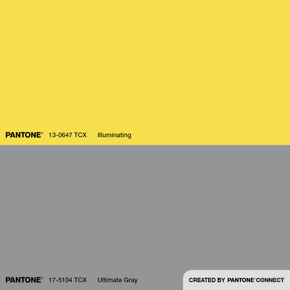
After the year 2020 has been, the colors chosen for 2021 are Illuminating and Ultimate 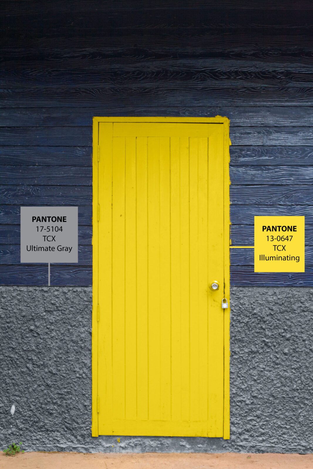 Grey. Together they signify resilience and hopefulness. “The union of enduring Ultimate Gray with the Vibrant yellow Illuminating expresses a message of positivity supported by fortitude. Practical and rock-solid, but at the same time warming and optimistic, this is a color combination that gives us resilience and hope. We need to feel encouraged and uplifted; this is essential to the human spirit.” – Leatrice Eiseman, Executive Director of the Pantone Color Institute.
Pantone describes “Illuminating as “a warming yellow shade imbued with solar power that oozes with cheer and Ultimate Gray as having solid and dependable elements which are everlasting and provide a firm foundation” according to the company’s website.
These influences and colors chosen every year are what help shape over 10 million designers and producers, including MMG. We use Pantone to match logos, websites, and print media. Color is an icon in the design industry and sets a mood for a whole project, MMG relies on Pantone for vibrant and distinct color matching that is universal all over the world.
The colors for 2021 is the first time since 2016 that Pantone released two colors of the year. In 2016 the colors chosen were Rose Quartz and Serenity colors, a pink and blue combination. According to Pantone, the colors were meant to blend into each other to represent gender fluidity.  The color for 2020 was Classic Blue symbolizing a sense of peace and clarity. While 2020 saw little to no peace, there has been some clarity to come out of 2020, and hopefully, in 2021, we see a dependable unity.
To learn more about Pantone please view this link: https://www.pantone.com/about-pantone
Recent Comments